By Kristin Ashley
Media Lab Assistant and Technology Instructor
Hi, I’m Kristin Ashley and I’m one of the Technology Instructors at the Lake Forest Library Media Lab. I’m also a graphic designer, fine artist and photographer.
Even if you are not a graphic designer, at some point many of us find ourselves using type and design to effectively communicate an idea, an event or a product. Most design programs such as InDesign, PowerPoint or Microsoft Word have templates available, and that makes designing easy. But learning the fundamentals of good design and achieving a basic understanding of using fonts properly can make the difference between a cookie-cutter layout and a custom marketing piece. By reviewing the historical principles of typography, this post will provide you with some basic guidelines to successfully communicate with type and design and will assist you in creating a custom layout.
To begin with, I’d like to show you how to get a deeper understanding of the history and practice of typography. Communicating visually is what graphic design is all about, and that can include both words and images. Although many of us are familiar with the use of fonts and images the way that they are used on a computer, the roots of design communication go way back to when early humans first began communicating abstract ideas through petroglyphs and cave drawings. Then came iconographic symbols that expressed complex ideas, like Sumerian writing and hieroglyphics.

In about 200 BCE, China led the way by creating papyrus, and using woodblock printing and movable type to create printed documents. In 1040, a porcelain printing press was invented that used movable type, pre-dating Gutenberg’s 1439 invention of the printing press in Europe by more than 1,000 years. From 1100-1600, the medieval art of creating illuminated manuscripts flourished, which incorporated both symbolic images and calligraphic type to express spiritual ideas.
The art of heraldry was developed about this same time, and incorporated elements such as icons, colors and shapes that expressed the values, qualities and characteristics of individual European clans, families and warriors. You might as well say that the art of heraldry began the era of logo identity. If your family crest was on a battle flag, for example, everyone knew which side of the battle you were on and you could at least avoid a sword through your armor by your own side!
The invention of movable type evolved through the early 19th century and much of the terminology we use in present day graphic design was developed during this time. For example, the that created the letter blocks was created in a foundry. That is the root of the word “font.” And modern-day type designers are still called “foundries” to this day.
The History of Common Font Terminology
The historical distinction between the terms “font” and “typeface” is that a typeface is a family of glyphs including letters, numerals and punctuation that are all set in a similar style, while the word “font” designates a specific member of a type family such as roman, boldface, or italic type. However, in our modern era, the terms are almost interchangeable, and most people are more familiar with the term “font.” So, for purposes of easy understanding, I usually refer to a typeface as a “font.”
The terms uppercase and lowercase actually illustrate the position of the letter blocks in a printer’s tray. Capital letters were placed in the upper case of a printer’s tray while small letters (or lowercase) were placed in a lower tray.
The word “baseline” refers to the imaginary line on which a line of type rests. In most fonts, the “descenders” (lowercase letters such as g, j, p, q, and y) usually extend below the baseline.
The term “leading” refers to the space between sentences and were originally varying sizes of actual lead strips that were inserted between lines of type during the era of moveable type. The “leading” (or line space) from baseline to baseline is typically 120% of the cap height of the font used.
Font Families
Fonts families were developed during the Renaissance era. The first font was a “blackletter” style font which was used for printing the Guttenberg Bible in 1439. This font was developed to mimic the calligraphy used in illuminated manuscripts. The first serif font was developed by Jenson in the early 16th century and was similar to the popular Times Roman font we are all familiar with.
A font family can include variations on the typestyle by using different weights and features such as regular (or roman), italic, bold, and bold italic. Some font families may also include a semi-bold version, a demi-bold version, a light or medium weight and even ornaments or “dingbats.”
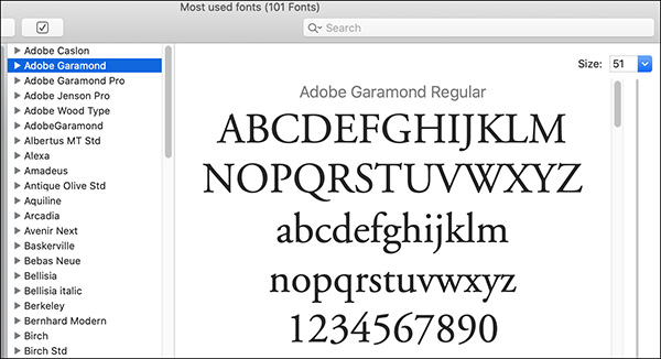
There is useful program on Apple Macintosh called “Font Book” that allows you to organize your fonts as well as review the weight and appearance of each font family that you have on your computer (see below).
Serif vs. Sans Serif Fonts
Serif Fonts
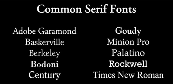
A serif font is a font that has a stroke that extends out from the top or bottom of each letter. This stroke was developed for ease of reading a sentence easily: look at a library book, for example, and you can see how the strokes lead your eye across the page. Serif fonts are still often used for larger amounts of text, especially in printing which uses a resolution of 300 dpi.
Sans Serif Fonts
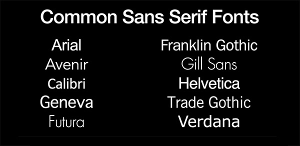
Sans serif fonts (like Helvetica) were developed for a cleaner look and were originally used for posters, headlines or less dense areas of text. In our digital age, they are often used for dense amounts of text instead of serif fonts because the strokes of a serif font appear to be very thin and actually make it harder to read on a computer monitor of 72 dpi.
Script Fonts
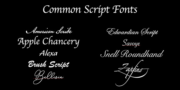
Scripts fonts are more decorative and mimic the calligraphic, or hand-written fonts of the illuminated manuscripts. They are best used in instances where there is a less dense amount of text: say, a headline or a wedding invitation.
Picas and Points
Type is measured in points. For example, a 72-point capital letter in any given font would be approximately one inch tall. Printers often used picas and points as their preferred unit of measurement and I also prefer to use this unit of measurement as well for my digital design work. For reference in comparison to an inch ruler, there are 72 points in an inch, 12 points in one pica and six picas in one inch. Using picas and points for your units of measure makes designing a breeze: and for me the best part is no more fractions!
Understanding Kerning, Tracking and Expanding
Type has come a long way since the advent of moveable type and typewriters. Kerning refers to the practice of adjusting the space between letters to a more pleasing optical view of letters that have the appearance of being “tucked in” to one another, such as the position of the letters in the word “AWAY.” “Tracking” adjusts spacing uniformly over a range of characters to insert spaces between each letter. “Expanding” type refers to the actual letter itself being expanded to be either taller and narrower, or shorter and wider.
Typewriters vs. Digital Printing
When each letter was encased in a metal “block” there was no room to adjust the letters next to each other, so kerning was not available and letters appeared to be in uniform squares of space next to each other. This block-like spacing is apparent in typewritten text. One of the holdovers from the era of typewriters was the rule that there must be two spaces after each paragraph. Otherwise, the sentences would appear too close together. However, with the advent of digital type and modern printing practices, this “rule” is no longer needed. So, for most printed documents, one space between each letter is now sufficient and also looks more professional.

Look for my class “Design and Typography Tips” on our events calendar. In my next blog, I’ll be going over some beginner-to-intermediate level Adobe InDesign tools, tips and principles. Many of these principles of good graphic design can also be applied to Word files. Be sure to look at our Media Lab events page to see the upcoming classes we have for the Winter season! And you’ll want to check back every few weeks for new blogs on technology and media topics written by myself and my colleague, Patrick.
We are also available for one-on-one virtual Media Lab sessions on Monday and Tuesday afternoons. Visit the Media Lab page on this site for more information, and to schedule your virtual appointment. In the meantime, stay safe and be healthy!