By Kristin Ashley
Technology Instructor and Media Lab Assistant
Squarespace is an easy-to-use web design program that provides templates, tools and other features for a WYSIWYG (“what you see is what you get”) design experience. Developed in 2003, Squarespace has become one of the more popular “do-it-yourself” website programs. But with Squarespace, there isn’t just a “cookie-cutter” approach to the template. Instead, there are a number of ways to customize the template to achieve the style and look you want–and without having to learn any coding! For example, you can choose your own fonts and color palette, as well as add or delete pre-made “Sections” that are relevant to your topic and theme including blogs, e-commerce, gallery and contact capture sections. You can insert and adjust images, too. Squarespace also provides a view of how your website will look on mobile devices. Just click on the smartphone symbol at the top right of the “Home” page for simulations of how your site will appear on smartphones and tablets.
Note that while this is not a "free" program, it does allow you a free trial period of 14 days, then if you want to continue it asks you to choose a plan to host your site. You can pay either a monthly or an annual fee, and it runs about $120/annually for hosting and use of the design templates. (Please check http://www.squarespace.com for the latest pricing and hosting information.)
Before you begin your website, you’ll want to prepare your website content by creating folders on your desktop for both text and images. Create a Word or text document of all the text you want to include in your site so that you can just cut and paste. Images should be adjusted prior to inserting in the site (although there is a basic Photoshop-like adjustment feature included in the program). The image format should be either a jpg or png. You may want to include a logo, too, if you don’t already have one. A free design program like http://www.Canva.com makes logo design easy.
The next step is to go to http://www.squarespace.com and set up an account. Your email is the username, or you can sign in using your Google or Facebook accounts. Choose a password and you’re ready to go. Once you log in, you’ll see the Dashboard. If you are just starting out, name your site and click on the “Create Website” button on the upper right of the Dashboard screen.
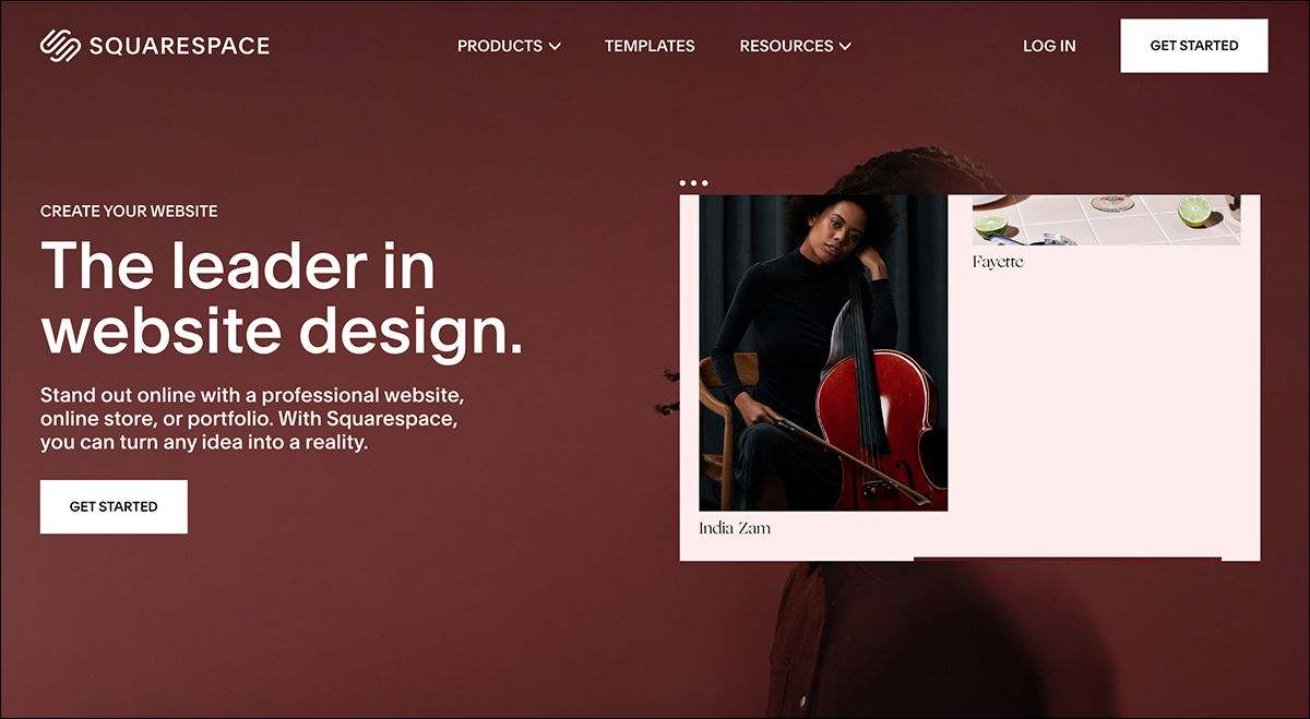
Create Your Custom Website
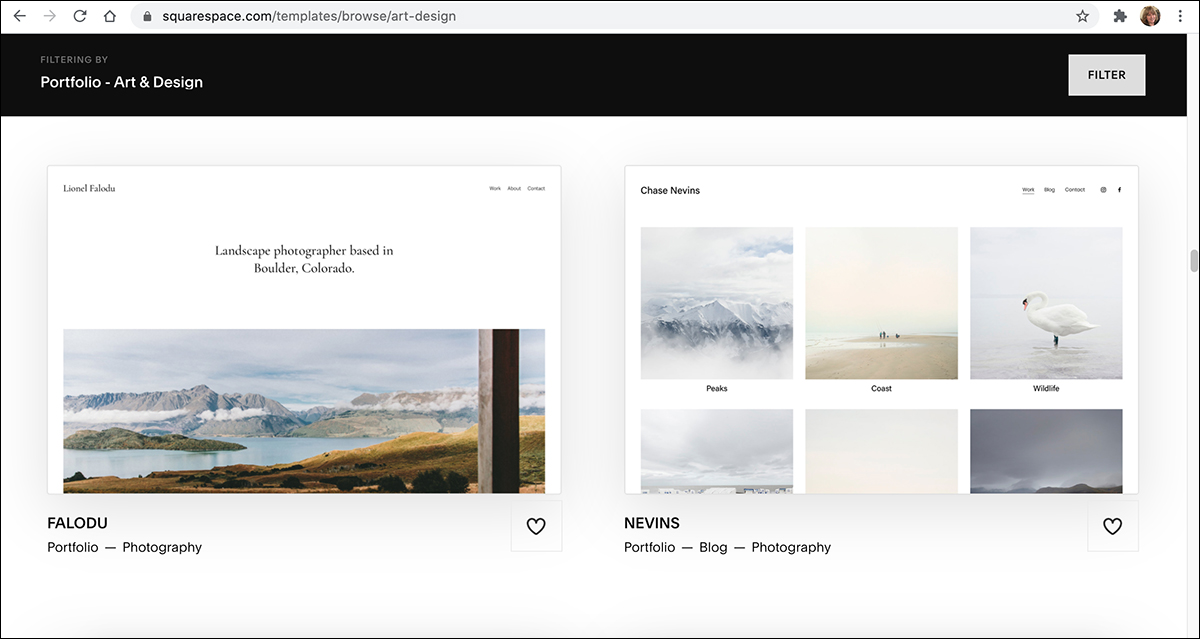
After clicking “Create Website,” the next page takes you to your site design options. You’ll see a “Starting Point” banner and in the left-hand panel, you’ll want to choose your website “Type” (if applicable) such as blogs and portfolios. Then, choose a “Topic” from the list that includes popular topics such as weddings, food, music, design or fashion, as well as other industries and professions. It will then give you the option to choose a template from the high-end looking website templates that best fit your type and topic (see below). For example, I’m planning a website for my creative work (art and photography), so I’m going to choose a template from the “Type' column: “Portfolio” and the topic will be “Art and Design.” (Note: like any program, you’ll want to “Save” frequently. Look for the “Save” button throughout the site.)
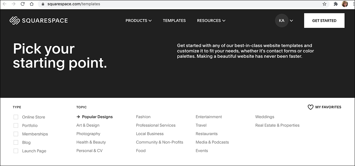
Choosing a Template
The Template page offers many options. Scroll down to see all the templates and click on the ones you like for a preview and choose one to begin your website. Because I am looking for a design that will focus on a portfolio of my artwork, I’m going to choose a template from the "Nevins" template family (see below). Just hover your mouse over the template you want to use click in the dialog box that appears. (Note: You can always switch to another template later to see how it looks. The template will adapt to your content as best as it can, then you can fine-tune it.)
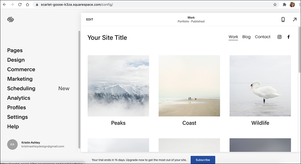
After you click the template you want, you will click through a series of “how-to” overview boxes where you can choose your site name and edit, create and style your website. The next screen shows your Main Page and your primary Dashboard options like Pages, Design, Commerce, Marketing and more. To begin, I’m going to choose “Design” from the panel on the left and set my custom colors and fonts. The “Design” sub-panel that follows after you click “Design” has several options for choosing your custom styles.
Choosing Your Font Family
Click the “Font” box on the “Design” panel (see panel below). There are a variety of attractive fonts available right in the program, both serif and sans serif, and you can experiment with the fonts to see how they will look on your template. Design tip: I usually stick to two fonts (or typefaces). For example, for your main text font, you may want to choose a sans serif font because is easy to read on the screen. If you add a second font (maybe a serif font for contrast) I’d reserve using it for the headlines. But, you can change them at any time, too–so why not try some experiments! Most font families also include options for creating bold, italic and regular weight characters unless they are a decorative font (like a script, or “wedding,” font). You can also set sizes and alignment options in this same submenu. There is also a submenu for setting up style sheets.
Choosing Your Custom Color Palette
After returning to the “Design” panel, choose “Colors.” The next dialog box will provide tools to create your own custom color palette. You can also choose a “Section Theme.” There are also options for creating a cohesive theme for your website by standardizing the style like black or white background for different sections, or a light or dark accent or color theme for other smaller items like your buttons and frames.
Adding Pages to Your Site
To add or remove the pages on your site, navigate to the left column of the Home page and choose “Pages” (see “Home” page image above). To add pages, go to the Main Navigation in the left-hand page and choose a page template for your additional site page. You can rename the page here as well. You can also choose “Blank Page” and create your own. To delete a page, first select it and then delete it.
Editing Placeholder Text and Images
To edit the content on a specific page, choose the pages you wish to edit–for example, “Work.” Click the “Edit” button at top left, which brings you to the edit page. Hover your mouse over the section you want to change to bring up the toolbox which assists you in editing both text and images. The pencil icon is used for editing, for example.
- To edit text, highlight the section and type in your text, or cut and paste from a Word file. From the drop-down menus for each page, you can also edit section height, content alignment (like flush left or centered, for example, and content width.
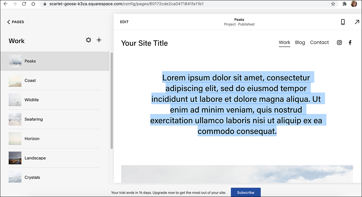
- To edit images, select the image from the gallery that you want to work with, choose the image tool and provide a description and a link to the url. You can add an image to the gallery also adjust and color retouch by choosing “Edit Image.” You can also crop the image or add filters by choosing one of those options in panel at the top right.
Working with Sections
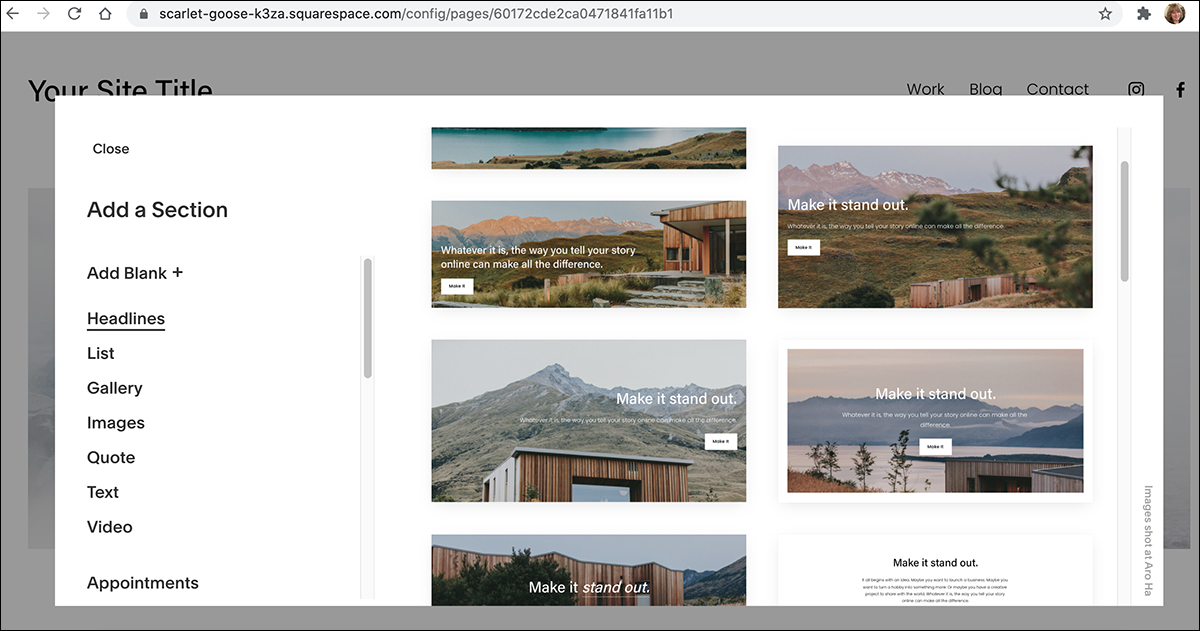
Pre-made Sections make designing your site easy. You can add or delete sections in any template. There are a number of sections to choose from including a gallery selection, which will be handy for my “Art and Design” theme.
- To add a section, hover over the sections and look for the blue “Add Section” button. A new list of sections will appear and you can choose the ones you want.
• To move a section, select the section by clicking on it and drag it to the desired location.
• To delete a section, just select the section and press delete.
Final Steps
You can now customize your footer information and add social media links by navigating to the Home page and Choose “Pages” (see Home page above, earlier in the article). You’ll want to change the copyright name and date in the footer by going to the Edit button then using the tools to highlight the copy you want to change, just like you did for the “placeholder” content above. (Tip: The line of copy at the bottom that reads: “Powered by Square Space” can be deleted.) You can even create your own “favicon,” which is the tiny symbol you see on the browser tab of all websites. A variation on your logo, or a small symbol that represents your company–or even just your initials–will give your project a professional finish.
At the present time, the Media Lab is closed to the public, but we look forward to seeing you at the Media Lab again soon. In the meantime, if you’d like to book a one-to-one virtual Zoom meeting with either my colleague Patrick or myself, just send us an email at: medialab@lakeforestlibrary.com. Tell us about your project and indicate your availability, and we will get you booked with one of us for a virtual one-on-one. Stay safe and well.